World’s oldest unchanged brand changes logo for the first time in over 140 years
by Admin

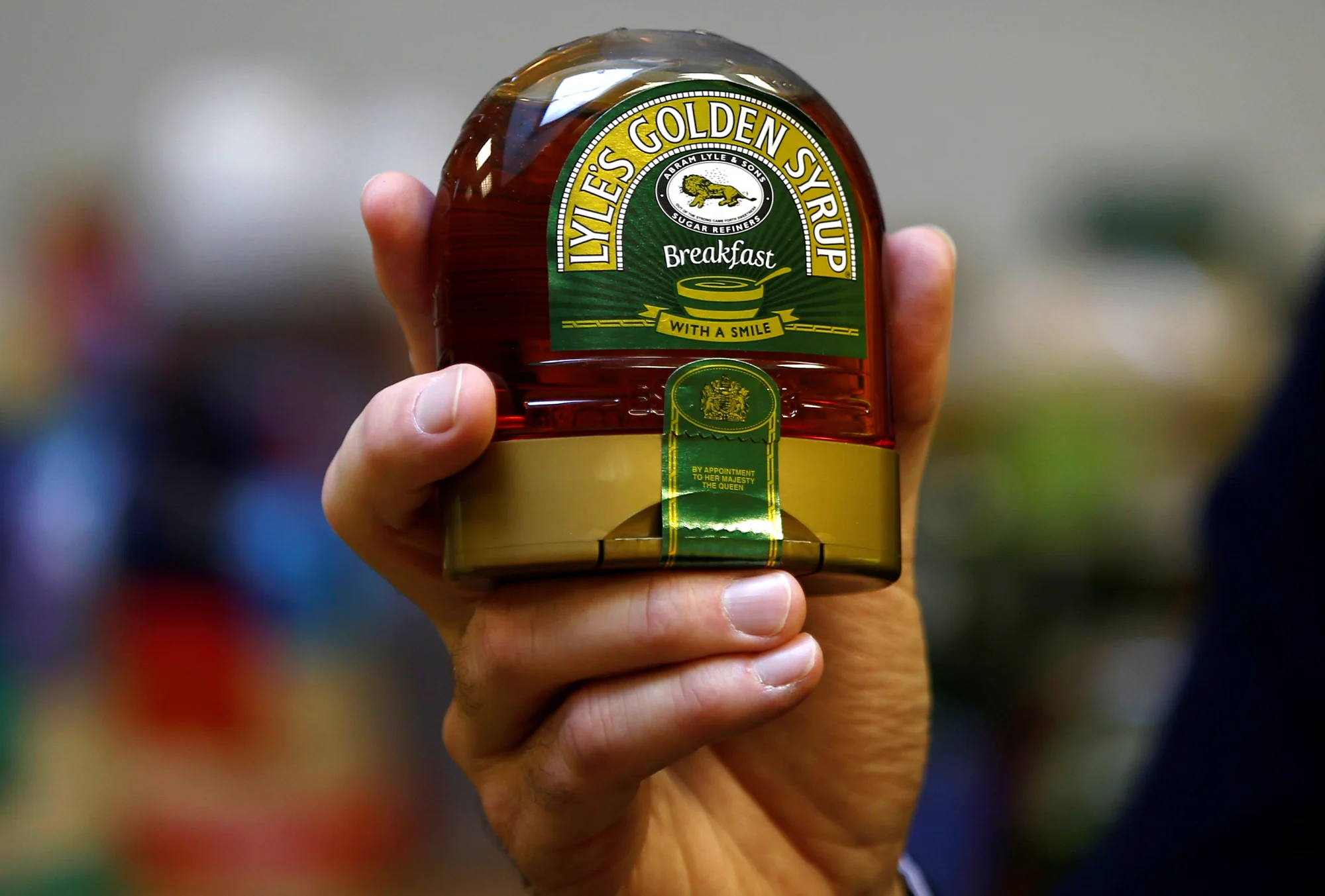
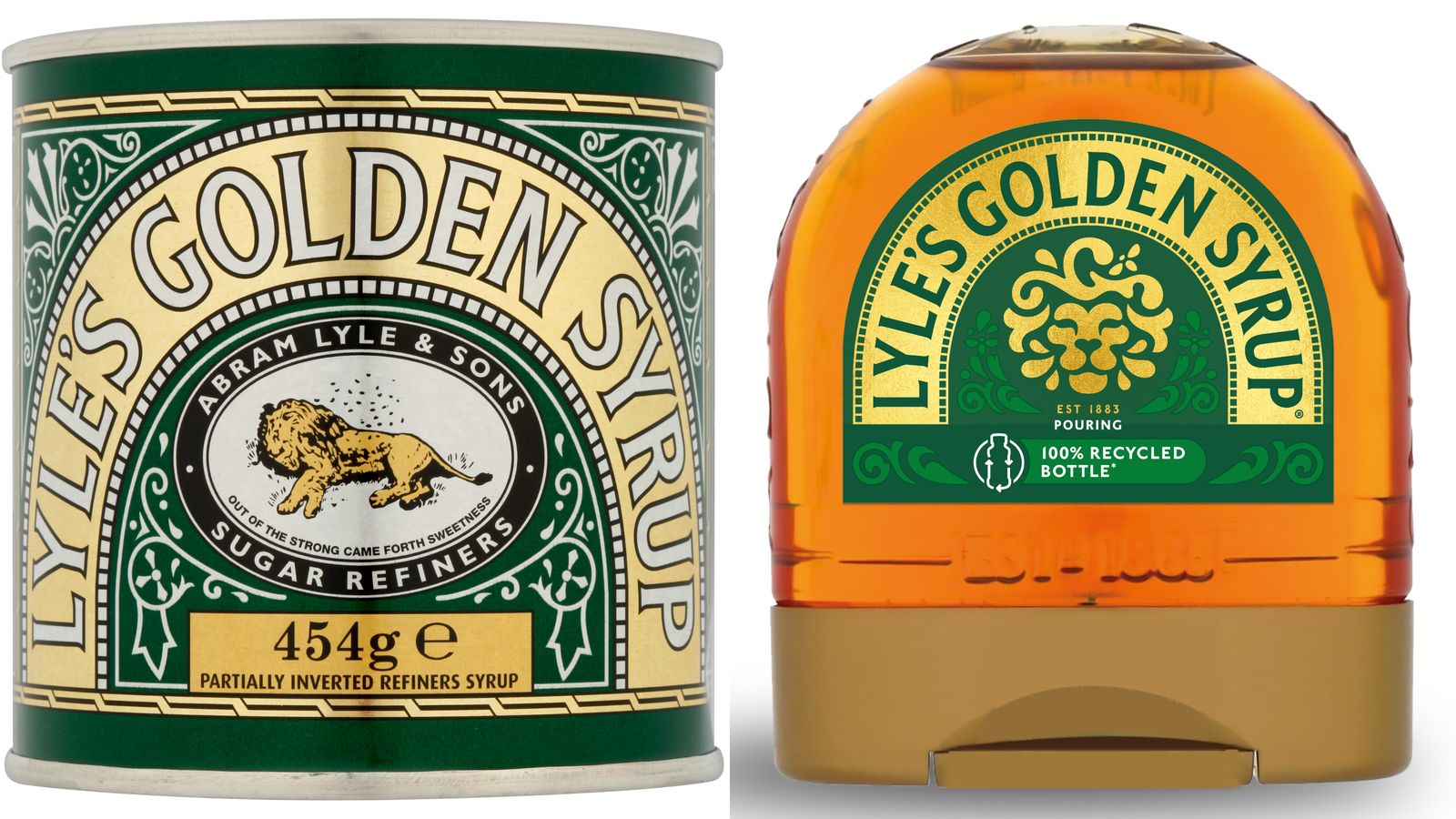
For over 140 years, Lyle’s Golden Syrup — a staple item in any British baker’s pantry — has featured a rather curious logo on its tin: a lion’s carcass surrounded by bees. But now, for the first time since the 1880s, the product recognized by Guinness World Records for having the world’s oldest branding and packaging is undergoing a major redesign.
The company said its new visual identity was designed to “refresh the brand’s legacy to appeal to a 21st century audience.”
In the biblical tale, part of the Book of Judges, Samson eats honey from inside the lion, gives some to his parents and then presents 30 wedding guests with a riddle alluding to the encounter: “Out of the eater came something to eat; out of the strong came something sweet.”
An alternative wording of the riddle, “Out of the strong came forth sweetness,” has featured on Lyle’s logo since its inception.

Lyle’s Golden Syrup
The new logo, meanwhile, gives the animal a more abstracted — and somewhat more animated — appearance. Just a single bee remains, located slightly above the lion’s head.
Tate & Lyle was formed in the 1920s when Lyle’s firm merged with rival sugar refinery Henry Tate & Sons. The company, now a major global food and beverage supplier, sold its sugar refining business (including Lyle’s Golden Syrup) to US firm American Sugar Refining, or ASR Group, in 2010.
The product’s old logo will continue to be used on Lyle’s classic golden syrup tin, though its bottles and dessert toppings will all now bear the new branding. A company spokesperson declined to comment on whether this represents a majority of the units sold.
In a statement, brand director for Lyle’s Golden Syrup, James Whiteley, said that “consumers need to see brands moving with the times and meeting their current need.”

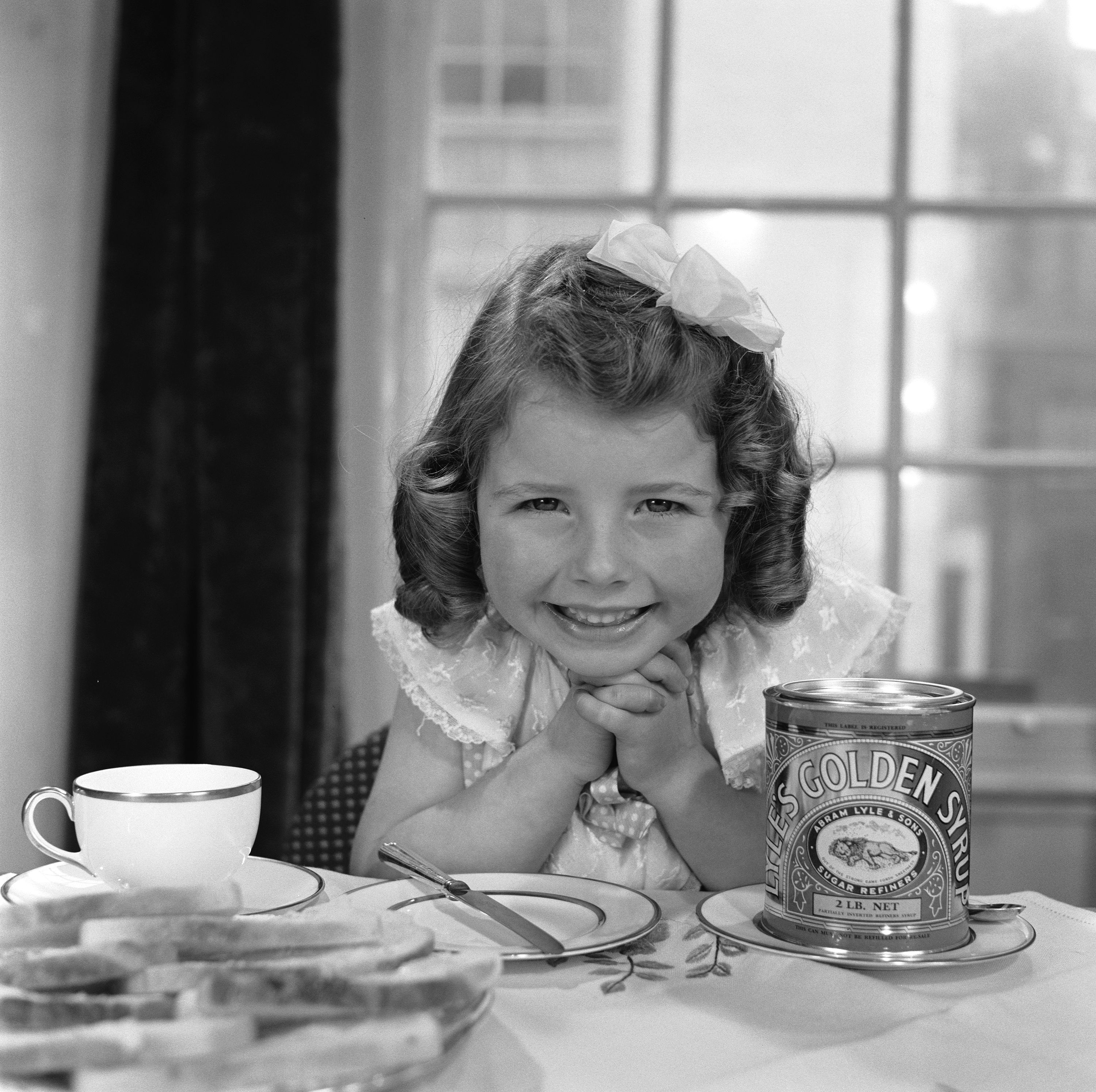
Jamie Hodgson/Hulton Archive/Getty Images
“Our fresh, contemporary design brings Lyle’s into the modern day, appealing to the everyday British household while still feeling nostalgic and authentically Lyle’s,” he added. Still, the redesign was met with mixed reactions. On Instagram, designer Laura Evans described the new logo as “contemporary and clever.” She added: “It cuts the fuss and gets straight to the point, whilst retaining the core essence and magic. It says more about the product’s texture and feel than the etched lion surrounded by bees did.”
Others however, including several Christian commentators, were less complimentary. “This is what happens when brand managers get involved: take a story that has survived 2000 years and ‘refresh’ it (i.e. ditch it),” author Colin Freeman wrote on X.
For over 140 years, Lyle’s Golden Syrup — a staple item in any British baker’s pantry — has featured a rather curious logo on its tin: a lion’s carcass surrounded by bees. But now, for the first time since the 1880s, the product recognized by Guinness World Records for having the world’s oldest branding and…
Recent Posts
- Liverpool ends 15-year curse with statement win over Real Madrid
- The TSA-approved hack that allows travelers to bring a bottle of water through airport security
- Подводный WiFi, аквапонные фермы: как морские техностартапы привлекают инвесторов
- “Подводный интернет”: эта женщина может подключить беспроводную сеть на 3-километровой глубине
- Inside the wild world of Osaka’s dangerous, adrenaline-fueled float festivals